Some Thoughts on Packaging and Retail Spaces
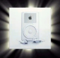
 Floating around on the web these past few weeks was a parody video asking what it would be like if Microsoft designed the packaging for the Apple iPod. The clip was amusing, but one thing that struck me is that I don't really like Apple packaging that much, and that (real) Microsoft packaging doesn't overly offend me. Now, even though I use antiquated machines running Windows, I do consider myself a fan of Apple and its history (especially the time period just as Steve Jobs returned to the company and began turning things around), though I've been skeptical of some of the more recent offerings.
But anyway, back to packaging. Apple products are often described as sexy, but why should one company get to decide for everyone what is sexy? I understand the appeal of simplicity in design, but I also have a personality that really likes information density.
 While it's true that Apple products come in distinctive and eye-catching boxes, their simplicity gives them an artistic appeal that is very different from the geek/otaku aesthetic that I'm used to and have grown to prefer.
Some have described otakuism as a form of information fetishism, and with that in mind, Apple packages just don't do it for me. I don't love Microsoft software, but I do like some of Microsoft's box designs. I am also a fan of devices made by Logitech and Creative, and enjoy their packaging as well. When it comes to electronics, I feel that at least one side of the package should be full of informative text and images that require a certain level of technical/media/cultural literacy to fully understand and appreciate. It's not enough that I can find the information elsewhere (like on the web). I like hardware packaging to look good and tell me a lot.

Logitech MX1000 (image courtesy of kennysia.com)
Another review with more images can be found here.
Where does this preference come from? As a kid, I would often choose my breakfast cereal based on which box was the most fun to read and look at (far more important to me than whatever prize was inside). I like potato chip bags and restaurant menus that tell the me the story behind the company. When watching anime fansubs, I like text all over the screen (sign translations, notes on content, song lyrics and translations). I don't buy DVDs unless they come with extensive extras (and throw in some dense liner notes while you're at it).
 Video games should have manuals that are fun and interesting to read cover-to-cover, not just skimmed once and then tossed aside. I'm not saying that Apple necessarily prefers style over substance when it comes to package design. I'm just saying that information density is its own style, albeit intended for a different target audience--people who have deeply internalized the concept of infornography. Quoting my own website (about the serial experiments lain anime):
"Infornography" seems to be a made up word combining information and pornography, the idea being that ... information is being considered not just a valuable commodity from a practical point of view, but something that generates an almost sexual thrill, something that we lust after and enjoy hunting because it is special and gives us power.Infornographically designed things have a visceral appeal1 of their own, even if it's not for everyone (or maybe even most people).
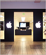
 We can look at retail spaces in the same way. Whenever I'm at the mall, I make it a point to visit The Apple Store to look and play with the various products, even though I'm not a big fan of the store's look and feel. When Apple stores first opened, they were exciting places, but I find them pretty boring these days. For the most part, they all look about the same inside. Like McDonald's, there are no surprises--you always know what to expect. When all is said and done, there's not really that much to look at (in my opinion, they ought to have videos running in their theater constantly). It's all the same stuff, and there's no thrill of the hunt. As someone who likes to spend hours in used bookstores, Apple stores are too sterile and deliberately constructed for my tastes.
For computer stuff, I prefer Fry's Electronics, but if you want to talk about my all time favorite shopping spaces, nothing beats Japan. Akihabara is great, of course, but I like the Nakano Broadway even better. Inside, it has floor after floor of different Mandarake (and other) stores selling anime and manga merchandise, and none of them are the same. Each store has a different speciality, and each is packed to the gills with unique and often rare merchandise, difficult to find even within the store. I spent almost a whole day wandering around in there, and I could have spent several more. It was paradise.

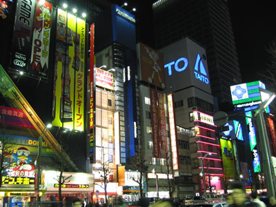
Akihabara at night (photo courtesy of Eddie Chen)

Rare and ultra expensive artbooks for sale at one of the Mandarake stores in the Nakano Broadway
I haven't been to Nipponbashi yet, but I hear that is another excellent otaku shopping destination. For now, anime convention dealers' rooms in the US are the next best thing--chaotic, dense, full of uninteresting stuff, but containing some hidden gems as well.
 Maybe I'm just biased against things that have clearly prescribed meanings. The iPod and chain stores in normal American shopping malls can get away with a certain amount of minimalism and repetitiveness when it comes to presenting information because everyone knows the iPod, The Apple Store, The Gap, Macy's, etc.--what they stand for, what they symbolize. These are American and global icons, brands that have seared themselves into our consciousness so that we don't need to read or think about them anymore when making purchase decisions.
Something about these uber-powerful brands bothers me a little. It probably has to do with the fact that I do like to read and think before I buy things, and too many voices are all around telling me that I don't have to, that the right choices are obvious. On the contrary, I think the right choices are far from obvious, and are contingent upon a wide range of local and personal factors. Furthermore, if our choices were obvious, they wouldn't be any fun.
Related reading:
Visceral design: do looks matter? the same subject discussed on Presentation Zen
Meet the Apple Pack Rats an article about Apple packaging and the people who love it
Package Development at Microsoft: How XBOX Broke Out of the Box
Revisiting the City Electric an article on Akihabara
Nakano Broadway
Den Den Town an article on Nipponbashi and retro gaming
AnimeCons.com Find anime conventions in your area
It turns out that Microsoft itself was responsible for producing the parody video. I love it!
ReplyDeleteHere's more info: http://www.ipodobserver.com/story/25957
From the article: "It was an internal-only video clip commissioned by our packaging [team] to humorously highlight the challenges we have faced RE: packaging and to educate marketers here about the pitfalls of packaging/branding,"
It seems like there might be some (healthy?) tension between the MS designers and the MS marketers. Anyhow, I hope the end result for MS is informative and visually interesting packaging that also avoids overwhelming customers with unnecessary details. Fun details, on the other hand...
Thank you for post that filled with lots of argumants that orient us to think more focused. (Sorry for my bad english)
ReplyDelete2006. wow time flies. commercial pressure washing
ReplyDeleteThis comment has been removed by the author.
ReplyDeleteNice blog. Thanks for sharing your thoughts on packaging and retail spaces. Very informative article. Office Refurbishments
ReplyDeleteI'm not saying that Apple necessarily prefers style over substance when it comes to package design. Jane
ReplyDelete