Monday, February 27, 2006
Out and About
For all my talk of world travel, I actually stay at home a lot. It's part of my existence as a grad student (and now stay-at-home-dad). However, I am pleased to announce that I'll be traveling soon.
First off, the good folks at Anime Punch! have graciously invited me to be a guest at their convention (March 31st - April 2nd). Anime Punch! is a relatively new and small con in Columbus, Ohio, but this is their first year at a hotel, and the schedule looks jam-packed with all sorts of cool stuff. Too many of the cons I've attended recently have had lackluster panels or simply not enough of them. That won't be the case this time. I've already agreed to host or co-host several panels, and I plan to attend many more. If you're going to be at the con, do stop by and say hello!
In May, I will be presenting some of my otaku research at the International Conference on Asian Comics, Animation, and Gaming 2006 at York University in Toronto, Canada. A number of my colleagues from the Anime and Manga Research Circle will be there as well, so I expect a good time will be had by all.
On a related note, if you want to see some of my work in print, I have an essay on otaku culture in Contemporary Youth Culture: An International Encyclopedia Vol. 1. The two hardcover volumes are quite pricey, but they're pretty cool if you can get ahold of them.
Sunday, February 19, 2006
Developing One's Evolutionary Quotient
How travel makes us smarter
Some of my friends on the Opera Community have been posting maps of the various countries they have visited. Having done a little bit of travel myself, I decided to make a few maps of my own, courtesy of Douwe Osinga's excellent map generators (see links below).
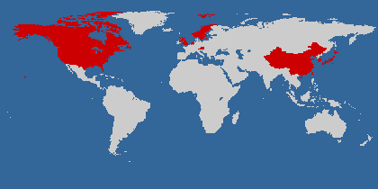
create your own visited countries map
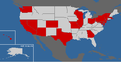
create your own visited states map
I haven't lived in most of those places for very long, which is a shame. Brief visits are nice, but I think you have to live somewhere for at least a month to start getting a real sense of familiarity. It took me a full year of living in Seoul before it felt like home, and now I miss it a lot.
I am reminded of Timothy Leary's Evolutionary Quotient (EQ), developed while he was in exile in Switzerland in the early 70's. EQ is a simple but not widely disseminated idea. I could barely find anything written about it on the web, and it's only discussed briefly in the notes for Chapter 37 of Leary's autobiography.
Very simply, one's Evolutionary Quotient is the number of one's mailing addresses divided by chronological age.
So, for example, I've had a total of 12 mailing addresses in 29 years, which makes my EQ = 12/29 = .41
I'm not counting the addresses of places that I spent less than a month at, and you shouldn't count business or school addresses (unless they were your primary place of residence).
Dr. Leary's point, of course, had to do with how our understanding of the world evolves in response to changing environments. The more places we have lived, the more likely it is that we've met different types of people with different ideas, knowledge, and value systems. It's a concept that celebrates pluralism. The more places we experience and the more people we meet (with tolerance and respect), the smarter we get.
The differences we encounter when living in a new place provide a sort of psychic shock, the intensity of which allows us to change and grow.
I'll miss the sea, but a person needs new experiences. They jar something deep inside, allowing him to grow. Without change, something sleeps inside us and seldom awakens. The sleeper must awaken. - Duke Leto Atreides from Frank Herbert's Dune (the movie)More than ever before, it can be argued, people move freely around the world, but even for those who can't, the internet provides many new opportunities for belonging to multiple communities and interacting with a broad range of people
Those who say that people only congregate with like-minded individuals online miss the simple fact that those who belong to a community surrounding a web browser, for example, are not likely to share exactly the same political views, tastes in entertainment, family values, etc. Online community diversity varies depending on the topic of the community. Anime fans online are a pretty diverse group. Big game hunters might be less so.
Monday, February 06, 2006
Opera Mini Simulator
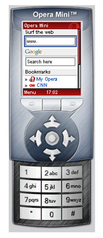 Opera Software recently released Opera Mini, which is now free to download. I mentioned Opera Mini in a previous post. For those of us who don't use smartphones, it's an excellent way to browse websites on the go.
If you're wondering what it's like, Opera has a very cool full-featured Opera Mini simulator you can try out. Even if you decide it's not for you, or if your phone can't run it, the simulator is worth trying just to see how your own webpages will look to people using Opera Mini.
[Note: To enter web addresses, you don't have to use the simulator's keypad. You can type them in using your keyboard.]
Thursday, February 02, 2006
Presentation Styles and Star Wars
In Presentation Zen, Garr Reynolds asks "What if Darth Vader - my favorite fictional bad guy - gave a formal presentation? How would it look? How would it compare to the presentation style of Yoda, the wise Jedi master?"
Hilarious graphics ensue...
Here is the link: Contrasts in presentation style: Yoda vs. Darth Vader
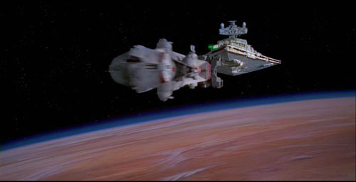
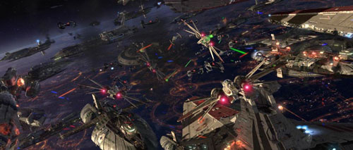
Considering the case for simplicity over complexity, one can also compare the opening scenes of Star Wars (1977, the original) versus Revenge of the Sith (2005, the latest). Both feature space battles, but their visual styles are completely different, which has a direct impact on emotional involvement (for me, at least).
In the original Star Wars, who can forget the first shots of the Imperial Star Destroyer chasing down and boarding Princess Leia's ship? The models were incredibly detailed, but the direction was simple and to the point. We, the audience, always knew where we were supposed to look. The camera angles used were effective but did not rely on complex movements.
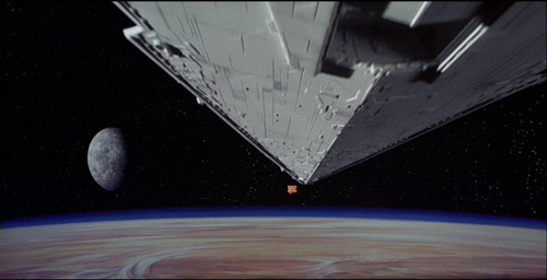
In Revenge of the Sith, however, we are thrust into an incredibly chaotic and detailed battle between numerous capital ships and smaller fighters. The audience is bombarded with details on all parts of the screen, and it's hard to know where we are supposed to look at any given time. The camera angles vary widely and our perspective is in constant motion. I think we are supposed to feel overwhelmed by excitement, but I wonder if the complexity only numbs our senses and prevents us from fully engaging with the action on an emotional level.
I think the appeal of the latter approach is that one can rewatch the scene over and over again to see new details. For the first time viewer, however, it can be distracting.
Simple and beautiful things are worth second looks, too. Despite the visual simplicity of the first Star Wars film, people can (and do) rewatch it all the time and relive the feelings of awe and excitement they originally experienced.
I am aware that the two scenes are not intended to tell the same story, and as such, each scene requires a different presentation style. [Then again, one could argue that both scenes involve a space battle/chase and the boarding of a ship.] Anyhow, I did enjoy both movies and their respective opening scenes. It's just that the opening of the original Star Wars still impresses me more.
For me, it's all about elegant simplicity and economy of motion, both of which require skill and experience. It's easy to obfuscate with details, but it takes hard work to focus your message into something that has real impact. Whether it's for making movies or giving presentations, what you decide to leave out is as important as what you include.
The problem with tab thumbnails
Why thumbnails are not enough, and how Opera's solution is already better.
The beta releases of Internet Explorer 7 have generated a lot of buzz, and one new feature that the browser has is the "Quick Tabs" function that allows one to view the contents of all open tabs onscreen at the same time. This is also possible in the Shiira browser, and is made possible in Firefox through extensions such as foXpose. Omniweb and Firefox (through an extension) also support page thumbnails in the sidebar/panel. There has been news that Opera 9 will have thumbnails displayed when you hover over the tab.
All of these solutions are interesting, but as far as I'm concerned, Opera already has a working solution that is very similar to and is even better than the ones I just mentioned. Opera has a leg up on the competition because of its MDI (multiple document interface) and ERA (extensible rendering architecture) capabilities. Before getting too technical, let's compare full-size screenshots of what can be done in Opera compared to what you can do in Firefox using the popular foXpose extension, which people say is very similar to the IE7 Quick Tabs feature. (I don't run XP on my laptop, so I can't install IE7). (The screenshots were taken on my computer running Windows 98 SE using Opera 9 technical preview 1 and Firefox 1.5.0.1. I'm using a 19 inch LCD monitor running at 1280 x 1024).
Using Opera, here is what it looks like when I have 9 tabs open and tiled:
(click on the image to see the full-size screenshot)

(click on the image to see the full-size screenshot)
Also, it's important to note that Opera's rendering prevents or at least drastically reduces the need for horizontal scrolling. In addition to the text being readable, the individual windows are actually active, meaning that you can scroll through them in their tiled state, click on links, refresh, go back and forth in their history, fill in text fields, and even view video without remaximizing the tiles. Notice that foXpose cannot display Flash animations, whereas in Opera, you can view multiple animations simultaneously in the different tiles. I can't demonstrate it without the benefit of video, but Opera tiles windows much faster than thumbnails are generated in Firefox, at least on my computer. Even with fewer tabs, Opera's tiles are still better looking than foXpose thumbnails:

Opera (click on the image to see the full-size screenshot)

Firefox (click on the image to see the full-size screenshot)
It's true that not every webpage will look perfect when rendered in a small window, but I consider that an acceptable tradeoff, especially considering the fact that switching from "Author mode" to "User mode" fixes most usability problems that occur.
Tiles versus thumbnails, in practice
You might ask, why do these differences matter? Do they really enhance the browsing experience? It's really about how a person wants to use tabbed browsing. Fuzzy thumbnails are enough if you just want to remember what pages you have open. Usually, though, when I keep several pages open for long periods of time, I can easily remember what they are just from reading the text on the tab.
Another way to use tabbed browsing is to open many pages at once (most modern browsers allow you to open many links simultaneously). When I do this, I don't actually want to read every page I just opened. I want to look through them quickly to decide which ones to read and which ones to close. In order to quickly scan the pages to make that decision, it is very useful to be able to read the text on each page. I think it makes more sense to evaluate a page based on its text rather than just an impression of its layout.
Also, with unreadable thumbnails, how do you distinguish between two different pages from the same site that have very similar layout? In the first two screenshots above, compare the two Digg pages I have open. Using foXpose, the only text that is readable is the page title, but anyone can already see that just by reading the text on the tabs. Using tiles in Opera, I can read the actual story and decide if it's worth my further attention.
How does Opera do it?
The technologies in Opera that make this possible are MDI (multiple document interface) and ERA (extensible rendering architecture). MDI is what allows Opera to display multiple pages simultaneously in the same browser window. Most Opera users use tabs most of the time, but MDI is still a feature of Opera, allowing the possibility of tiled windows.
ERA is what makes the tiled pages look good. Opera is well-known for its excellent mobile browser, and the strength of that product is its small screen rendering (SSR) feature--which is part of Opera's Extensible Rendering Architecture. Using the same technology, Opera can make small tiled windows on the desktop that are both good looking and usuable.
Here are some resources about ERA:
Opera's rendering modes
Setting the default rendering mode
How do I set it up?
The most important thing to do is to set the rendering mode so that "Fit-to-window-width" is always activated. If you use Opera 9tp1, you can type opera:config into the address bar to access the large list of preferences. Under "User Prefs", find "Rendering mode" and change it from 0 to something else. I typically use rendering mode=4, but 3 and 5 might also work [edit (2/3/06): see the first comment below]. Click "OK" at the bottom. When you open a new window, that rendering mode will be in effect for any page or pages you open.
If you use Opera 8.51, you have to edit the opera6.ini file which is found in the "profile" folder which is a subdirectory of your Opera folder. There, look for "rendering mode" and change it to 4. Make sure you don't edit the file while Opera is in use. [Note: ERA has been a part of Opera since November 2004, and MDI has been a part of Opera from very early on, so it should be possible to do the same thing in some earlier versions of Opera]
That's all the setup you have to do! To tile your tabbed pages, just right click on any tab, select "Arrange" and then click on "Tile vertically". When you want to remaximize the pages, select the page you want to be active, and then click on "Maximize all" (instead of "Tile Vertically"). As you can see in the screenshots above, I created a "Tile" and "Maximize" button to make this easier. You can use The Opera Custom Button & Command Creator. When creating the "tile" and "maximize" buttons, you want to use the "Tile vertically" and "Maximize all" commands, respectively.
As with other things in Opera, you can also use custom keyboard (and possibly mouse) shortcuts to do the same thing.
The beta releases of Internet Explorer 7 have generated a lot of buzz, and one new feature that the browser has is the "Quick Tabs" function that allows one to view the contents of all open tabs onscreen at the same time. This is also possible in the Shiira browser, and is made possible in Firefox through extensions such as foXpose. Omniweb and Firefox (through an extension) also support page thumbnails in the sidebar/panel. There has been news that Opera 9 will have thumbnails displayed when you hover over the tab.
All of these solutions are interesting, but as far as I'm concerned, Opera already has a working solution that is very similar to and is even better than the ones I just mentioned. Opera has a leg up on the competition because of its MDI (multiple document interface) and ERA (extensible rendering architecture) capabilities. Before getting too technical, let's compare full-size screenshots of what can be done in Opera compared to what you can do in Firefox using the popular foXpose extension, which people say is very similar to the IE7 Quick Tabs feature. (I don't run XP on my laptop, so I can't install IE7). (The screenshots were taken on my computer running Windows 98 SE using Opera 9 technical preview 1 and Firefox 1.5.0.1. I'm using a 19 inch LCD monitor running at 1280 x 1024).
Using Opera, here is what it looks like when I have 9 tabs open and tiled:

(click on the image to see the full-size screenshot)

(click on the image to see the full-size screenshot)
Also, it's important to note that Opera's rendering prevents or at least drastically reduces the need for horizontal scrolling. In addition to the text being readable, the individual windows are actually active, meaning that you can scroll through them in their tiled state, click on links, refresh, go back and forth in their history, fill in text fields, and even view video without remaximizing the tiles. Notice that foXpose cannot display Flash animations, whereas in Opera, you can view multiple animations simultaneously in the different tiles. I can't demonstrate it without the benefit of video, but Opera tiles windows much faster than thumbnails are generated in Firefox, at least on my computer. Even with fewer tabs, Opera's tiles are still better looking than foXpose thumbnails:

Opera (click on the image to see the full-size screenshot)

Firefox (click on the image to see the full-size screenshot)
- Tiled windows are clear and readable, as opposed to fuzzy thumbnails
- Tiled windows are active webpages, and not just static images
- Tiled windows are generated faster
It's true that not every webpage will look perfect when rendered in a small window, but I consider that an acceptable tradeoff, especially considering the fact that switching from "Author mode" to "User mode" fixes most usability problems that occur.
Tiles versus thumbnails, in practice
You might ask, why do these differences matter? Do they really enhance the browsing experience? It's really about how a person wants to use tabbed browsing. Fuzzy thumbnails are enough if you just want to remember what pages you have open. Usually, though, when I keep several pages open for long periods of time, I can easily remember what they are just from reading the text on the tab.
Another way to use tabbed browsing is to open many pages at once (most modern browsers allow you to open many links simultaneously). When I do this, I don't actually want to read every page I just opened. I want to look through them quickly to decide which ones to read and which ones to close. In order to quickly scan the pages to make that decision, it is very useful to be able to read the text on each page. I think it makes more sense to evaluate a page based on its text rather than just an impression of its layout.
Also, with unreadable thumbnails, how do you distinguish between two different pages from the same site that have very similar layout? In the first two screenshots above, compare the two Digg pages I have open. Using foXpose, the only text that is readable is the page title, but anyone can already see that just by reading the text on the tabs. Using tiles in Opera, I can read the actual story and decide if it's worth my further attention.
How does Opera do it?
The technologies in Opera that make this possible are MDI (multiple document interface) and ERA (extensible rendering architecture). MDI is what allows Opera to display multiple pages simultaneously in the same browser window. Most Opera users use tabs most of the time, but MDI is still a feature of Opera, allowing the possibility of tiled windows.
ERA is what makes the tiled pages look good. Opera is well-known for its excellent mobile browser, and the strength of that product is its small screen rendering (SSR) feature--which is part of Opera's Extensible Rendering Architecture. Using the same technology, Opera can make small tiled windows on the desktop that are both good looking and usuable.
Here are some resources about ERA:
Opera's rendering modes
Setting the default rendering mode
How do I set it up?
The most important thing to do is to set the rendering mode so that "Fit-to-window-width" is always activated. If you use Opera 9tp1, you can type opera:config into the address bar to access the large list of preferences. Under "User Prefs", find "Rendering mode" and change it from 0 to something else. I typically use rendering mode=4, but 3 and 5 might also work [edit (2/3/06): see the first comment below]. Click "OK" at the bottom. When you open a new window, that rendering mode will be in effect for any page or pages you open.
If you use Opera 8.51, you have to edit the opera6.ini file which is found in the "profile" folder which is a subdirectory of your Opera folder. There, look for "rendering mode" and change it to 4. Make sure you don't edit the file while Opera is in use. [Note: ERA has been a part of Opera since November 2004, and MDI has been a part of Opera from very early on, so it should be possible to do the same thing in some earlier versions of Opera]
That's all the setup you have to do! To tile your tabbed pages, just right click on any tab, select "Arrange" and then click on "Tile vertically". When you want to remaximize the pages, select the page you want to be active, and then click on "Maximize all" (instead of "Tile Vertically"). As you can see in the screenshots above, I created a "Tile" and "Maximize" button to make this easier. You can use The Opera Custom Button & Command Creator. When creating the "tile" and "maximize" buttons, you want to use the "Tile vertically" and "Maximize all" commands, respectively.
As with other things in Opera, you can also use custom keyboard (and possibly mouse) shortcuts to do the same thing.
Subscribe to:
Posts (Atom)